Building an Artist’s Visual Identity Before the First Release
Before the first single goes out, an artist needs a look that people can recognize. Here is how we approach visual identity from the ground up.
Rich Prince Media · · 4 min read
A new artist usually arrives with music that is ready and a visual presence that is not. There are some phone photos, a logo a friend made, and an Instagram grid that changes style every week. Then a release date gets set and suddenly everything needs to look like it belongs to one person.
We think visual identity should be built before the first release, not during it. People decide very quickly whether an artist looks serious, and the first images you put out will follow you for years.
What visual identity actually means
It is not a logo. A logo is a small part of it, and for many artists it is not needed at all. Visual identity is the set of choices that make your images recognizable without your name on them:
- A colour world: two or three tones that keep showing up in wardrobe, sets and grading.
- A styling direction: what you wear, how your hair and makeup are done, what you never wear.
- A photographic language: lighting style, lens choice, framing, how close the camera gets.
- Typography for covers and titles, chosen once and used consistently.
- An attitude. Do you look into the lens or past it? Are you still or in motion?
When these choices line up with the music, the audience feels it even if they could not explain why.
Start from the music and the person
We begin with listening and conversation. What does the music sound like, and what are the references the artist grew up with? Where are they from, and what do they want people to feel? An identity built on borrowed trends looks dated within a year. One built on who the artist actually is ages much better.
This is the core of our artist development work: turning the sound and the story into a set of visual decisions that a whole team can follow.
An example: twin power, framed in gold
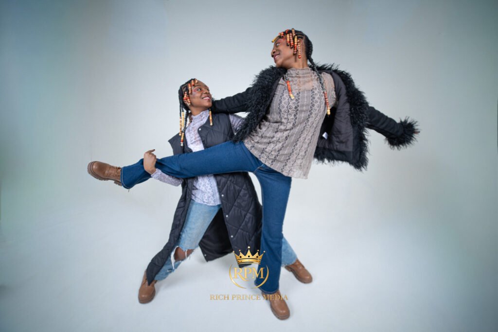
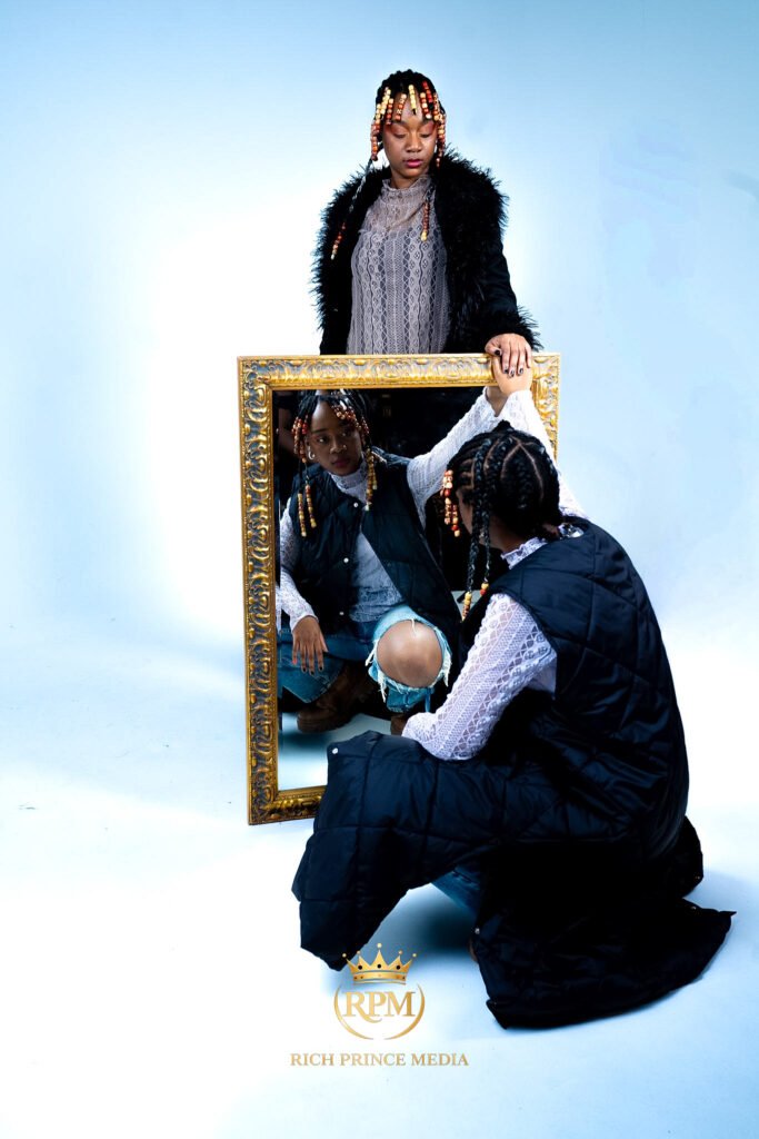
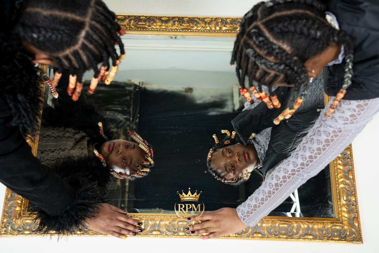
When we worked with Gem Shadou, the twin duo Cece and Joce, the identity was already in the people. Two sisters, Caribbean roots, a sound that refuses to sit in one genre. The visual answer was gold-toned styling and mirrored, twin compositions, alongside full-length portraits and an on-camera interview. The idea is simple to say: twin power, framed in gold. That simplicity is what makes it work. Anyone on the team, from a stylist to an editor, can understand it and apply it.
That is the test we use. If you cannot describe the identity in a sentence, it is probably not clear enough yet.
Build the core image library first
Before release, an artist needs a small, strong set of images that can carry the first few months. We usually plan a dedicated photography session that delivers:
- Hero portraits for press, profile pictures and the EPK.
- Full-length images that show styling and body language.
- Horizontal and vertical crops, because a press header and a story frame need different shapes.
- Images with negative space where text can sit for covers, posters and show announcements.
- A few motion clips from the same session, so photo and video feel like one world.
Shooting these in one planned session keeps lighting, styling and grading consistent. Five sessions with five photographers will give you five different artists.
Consistency is more important than variety
New artists often worry about looking repetitive. In the early stage, repetition is the point. Audiences need to see a look several times before it becomes yours. Change it every post and nobody gets the chance to remember it.
That does not mean every image is identical. It means the variations happen inside a clear frame. Different locations, same colour world. Different outfits, same styling logic. Different songs, same grading approach.
Write it down
We recommend a simple style guide, even a short one. A page or two with:
- Your colour references and a few approved images.
- Fonts for titles and covers.
- Styling do's and don'ts.
- How your name is written, including capitalization and spacing.
This becomes useful the first time someone else makes something for you: a promoter designing a show flyer, a designer making merch, or a director pitching a video. It protects the identity when you are not in the room.
Leave room to grow
An identity is a starting point, not a cage. Artists evolve, and the visuals should follow, usually at the edges of an album cycle rather than in the middle of a rollout. The goal of the first identity is to give people something clear to hold on to. You can surprise them later, once they know who you are.
Common mistakes we see
- Designing a logo before deciding on a look.
- Copying a current star's aesthetic so closely that it reads as a tribute.
- Shooting the first release's artwork without thinking about the second.
- Using filters and presets that change from post to post.
If you are preparing a first release and want to build the look properly before it goes out, we would be glad to hear about the music and the person behind it. Start a conversation with us and we can work out what you actually need.